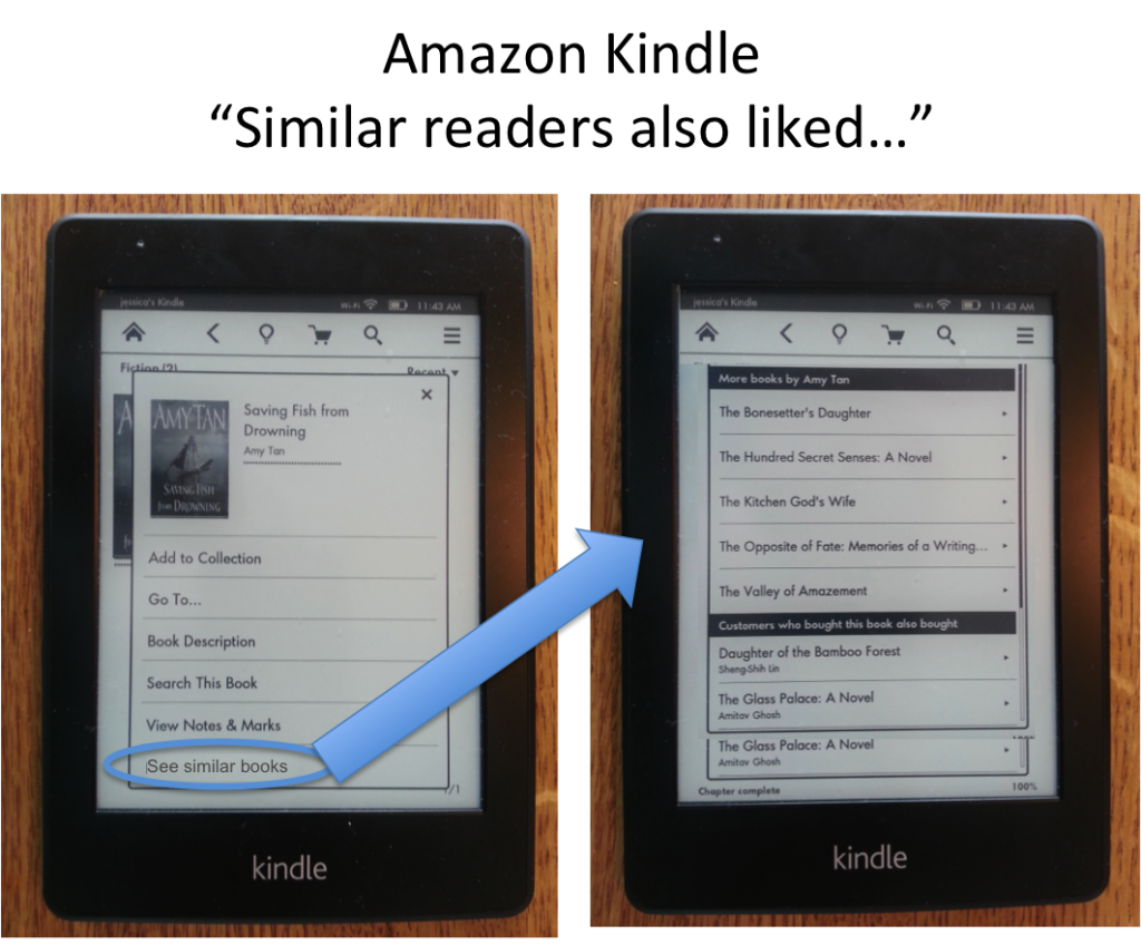
Background: I’m in the mood for a new book. A business book? Nah. A novel? Sure! Deep and intricate? No – lighter, like the last Amy Tan book I read, “Saving Fish from Drowning”. I pick up my kindle, assuming it’ll be pretty easy for my Kindle to show me similar books…
Problem: There is no quick, easy, and intuitive way to find similar books. Readers can:
1) Navigate to the very end of the book, after all of the thank-you’s, additional author notes, Library of Congress details, and get to a page that offers up “More books by Amy Tan” and a “Customers who bought this book also bought” list. Readers may not even know or remember that it exists here – and it’s quite buried even if you do know to look for it.
2) Go to the shopping cart and scroll through the “recommended” list, but it does not tie the books back to what causes them to be recommended. These are general recommendations, based off of all the books you’ve read—which doesn’t help when I want recommendations related to a specific author, genre, or feeling.
3) Go to the shopping cart and type in the name of the book or the author, then select it, then scroll down to see a short 3-item list of “Customers who bought this also bought”, and then select “see all” so you can see more than those three… A process which is doable, but definitely more cumbersome than necessary.
Recommendation: When a reader holds down on the image of the book in their collection, which pops up a list of options, Kindle should provide an additional option that says: “See similar books”. This option would show the reader the same two lists that already exist, buried after finishing a book: “More books by Amy Tan” and “Customers who bought this book also bought”.
Business benefit: Faster conversion—and faster conversion almost always means increased conversion rates. The longer it takes to convert, the more opportunity there is for abandonment. Plus, the faster a person starts reading, the sooner they will be ready to buy their next book, helping to create a shorter cycle and increasing revenue.
Reader benefit: It is a faster, two-click experience, directly tied to the type of book you’re interested in. It feels like the Kindle has read your mind and knows how to help you. You get the targeted information you’re looking for more quickly, can make your decision, and happily start reading your next book asap. As the reader, you feel like your Kindle facilitated what you needed in the context of how you wanted to do it—and you smile. That’s the experience Kindle and Amazon should be creating for you!

