Calendar confusion

Blew my mind. There are some very common calendar conventions; this is not one of them.

If there’s a paradigm the world is accustomed to, there should be a very very very good reason to present it differently. There is no good reason here.

I’d love to know how much longer it takes people to book on this site, or how many ‘wrong day’ bookings they have. My guess is “longer” and “more” than if they just used common calendar conventions.

Facebooktwitterredditpinterestlinkedinmailby feather

Amazon Kindle: You should upsell me better!

Background:  I’m in the mood for a new book. A business book? Nah. A novel?  Sure! Deep and intricate? No – lighter, like the last Amy Tan book I read, “Saving Fish from Drowning”.  I pick up my kindle,  assuming it’ll be pretty easy for my Kindle to show me similar books…

Problem: There is no quick, easy, and intuitive way to find similar books. Readers can:

1)   Navigate to the very end of the book, after all of the thank-you’s, additional author notes,  Library of Congress details, and get to a page that offers up “More books by Amy Tan” and a “Customers who bought this book also bought”  list.  Readers may not even know or remember that it exists here – and it’s quite buried even if you do know to look for it.

2)   Go to the shopping cart and scroll through the “recommended” list, but it does not tie the books back to what causes them to be recommended.  These are general recommendations, based off of all the books you’ve read—which doesn’t help when I want recommendations related to a specific author, genre, or feeling.

3)   Go to the shopping cart and type in the name of the book or the author, then select it, then scroll down to see a short 3-item list of “Customers who bought this also bought”, and then select “see all” so you can see more than those three… A process which is doable, but definitely more cumbersome than necessary.

Recommendation: When a reader holds down on the image of the book in their collection, which pops up a list of options, Kindle should provide an additional option that says: “See similar books”. This option would show the reader the same two lists that already exist, buried after finishing a book:  “More books by Amy Tan” and “Customers who bought this book also bought”.

Business benefit:  Faster conversion—and faster conversion almost always means increased conversion rates. The longer it takes to convert, the more opportunity there is for abandonment. Plus, the faster a person starts reading, the sooner they will be ready to buy their next book, helping to create a shorter cycle and increasing revenue.

Reader benefit: It is a faster, two-click experience, directly tied to the type of book you’re interested in.  It feels like the Kindle has read your mind and knows how to help you.  You get the targeted information you’re looking for more quickly, can make your decision, and happily start reading your next book asap. As the reader, you feel like your Kindle facilitated what you needed in the context of how you wanted to do it—and you smile. That’s the experience Kindle and Amazon should be creating for you!

Image of new Kindle menu option when you press down a book

Improved menu option to put “similar books” right at your fingertips

Facebooktwitterredditpinterestlinkedinmailby feather

MacBook Air / Chrome browser: Be smarter about the swiping experience!

Problem: I can’t tell you how many times I’ve been using my Mac with a chrome browser and, in the middle of filling out a form (airline tickets, play tickets, you name it), accidentally swiped the touchpad in such a way that it thinks I wanted to go back to the previous webpage— form be d***ed.  I lose all the data I’ve filled out and frustratingly have to go “forward” again… and tediously fill it all out, again, praying my fingers don’t swipe funnily again.  [And yes, I know I could turn off this feature altogether, but then it loses its charm in non-form situations when it is actually helpful!]

Recommendation: It would save much heartache if the browser was smart enough to know when you’re filling out a form.  In that case, if it detects that you’ve make that gut-wrenching-oops-of-a-back-stroke on your touchpad, it can ask you: “Are you sure you want to abandon your form and lose all that you’ve input?”.  It can even offer to remember your choice in case someone loves to abandon and doesn’t want this safety net, but I’d bet that when a user is filling in a form, well over 80% of the time the “back” is an unintentional, painful mistake. And of course, it should be smart enough to know that if you’re always telling it “No, I don’t want to abandon”, that it just ignores that swipe in form-filling-out situations.

User-benefit:  With this little question, the user will have less angst and frustration (not to mention speed!) when filling out an important form…enjoying their mac and its experience, like they’re supposed to!

Confirmation message "Did you mean to abandon your form and lose all the information?"

Example of the browser being smart about what a “swipe” really means when filing out a form.

Facebooktwitterredditpinterestlinkedinmailby feather

SpeediShuttle: Start your customers off happier!

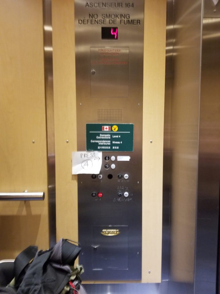
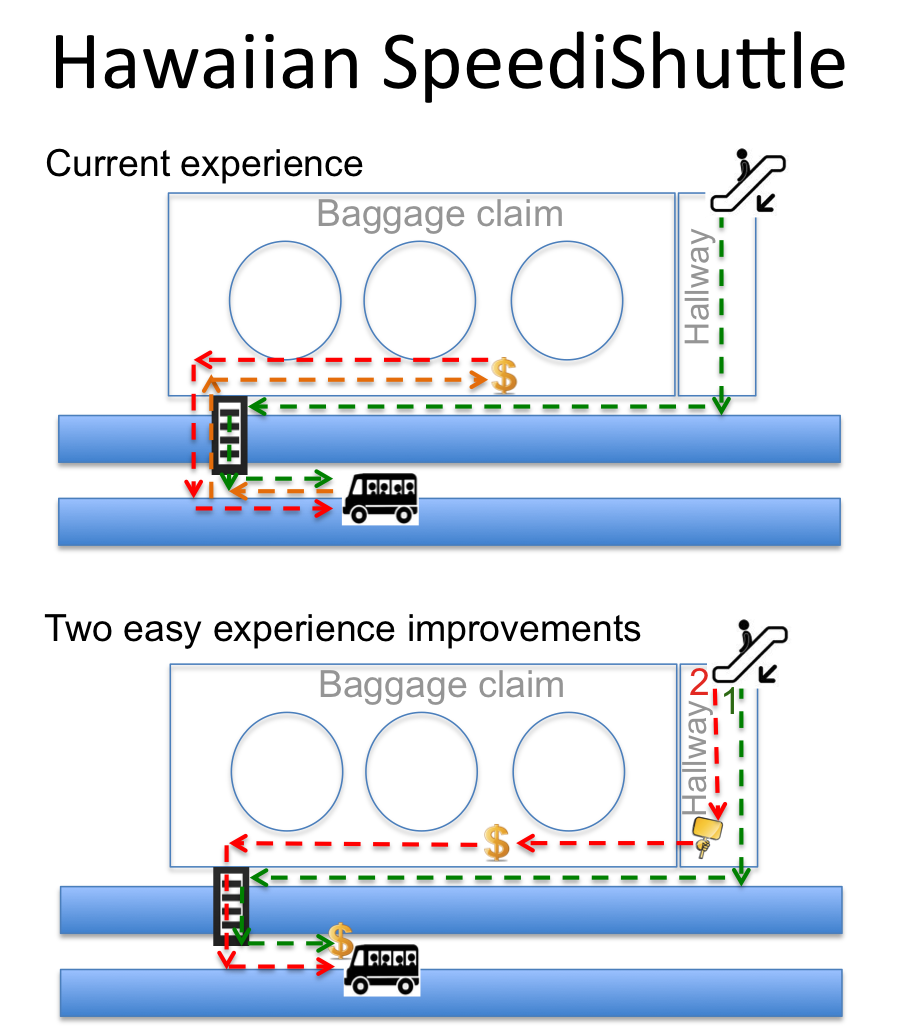
Background: Without any luggage to pick up in baggage claim, it was a breeze to exit the Honolulu airport and get outside. I came down the escalator, shot straight through the hallway and onto the street. Looking way down to my right, I saw the SpeediShuttle stand, and with my destination in sight, I rolled my bag down to the nearest crosswalk (which was past the SpeediShuttles), crossed over, and then backtracked to the red Hawaiian-shirt SpeediShuttle employee in front of the vans.  “Where’s your ticket”, he asked. “Uh, can I get a ticket from you?” I asked. “No, you have to get one inside, didn’t you hear them? They’re all around baggage claim!” My response: “No, I don’t have any baggage, so I didn’t go to baggage claim. You mean I have to go BACK inside to get a ticket? I can’t get one from you, here?” … And the answer was that yes, I needed to go back inside to find the other red-hawaiian-shirted people, with portable credit card machines around their necks to purchase a ticket.

Frustrated and annoyed at the inefficiency after my 6hour flight, I scurried back down the median, crossed over the crosswalk, entered the teeming baggage claim area and sought the uniformed busker-like shouters.  During the mobile purchase process, another huffing and puffing guy in the same boat raced up too. It wasn’t just me. 2 for 2. Bad experience.

Back to the shuttles we both traipsed, wondering aloud how in the world, with so many tourists, there wasn’t a better way.

Problem:  There are no signs to direct tourists into baggage claim to purchase a ticket and if a to-be customer arrives at the shuttle, they must be sent back inside. This is inefficient and frustrates customers right off the bat. They may be stuck using the shuttle, but they’re less likely to give good reviews or leave “Hey what a great experience!” tips.

Recommendation:  Do not assume all people will come through baggage claim. SpeediShuttle should either 1. Provide the people at the shuttles with a mobile machine for purchasing or 2. Put a sign in the hallway which directs customers into baggage claim to purchase tickets.

Business Benefits: SpeediShuttle should see an increase in customer satisfaction ratings, which also has the possibility of increasing tips

Customer Benefits: For a non-negligible percent of your customers, they could have a much faster, easier, more relaxing experience. In 2012, 9,225,848 people came through Honolulu airport (FAA.gov). If only 5% of them took SpeediShuttle (the only pre-booked group shuttle service available), and only 10% of those customers had no baggage, that’s 46,000 people per year who could have a slicker experience, leaving them with an Aloha smile on their face.

SpeediShuttle walking map

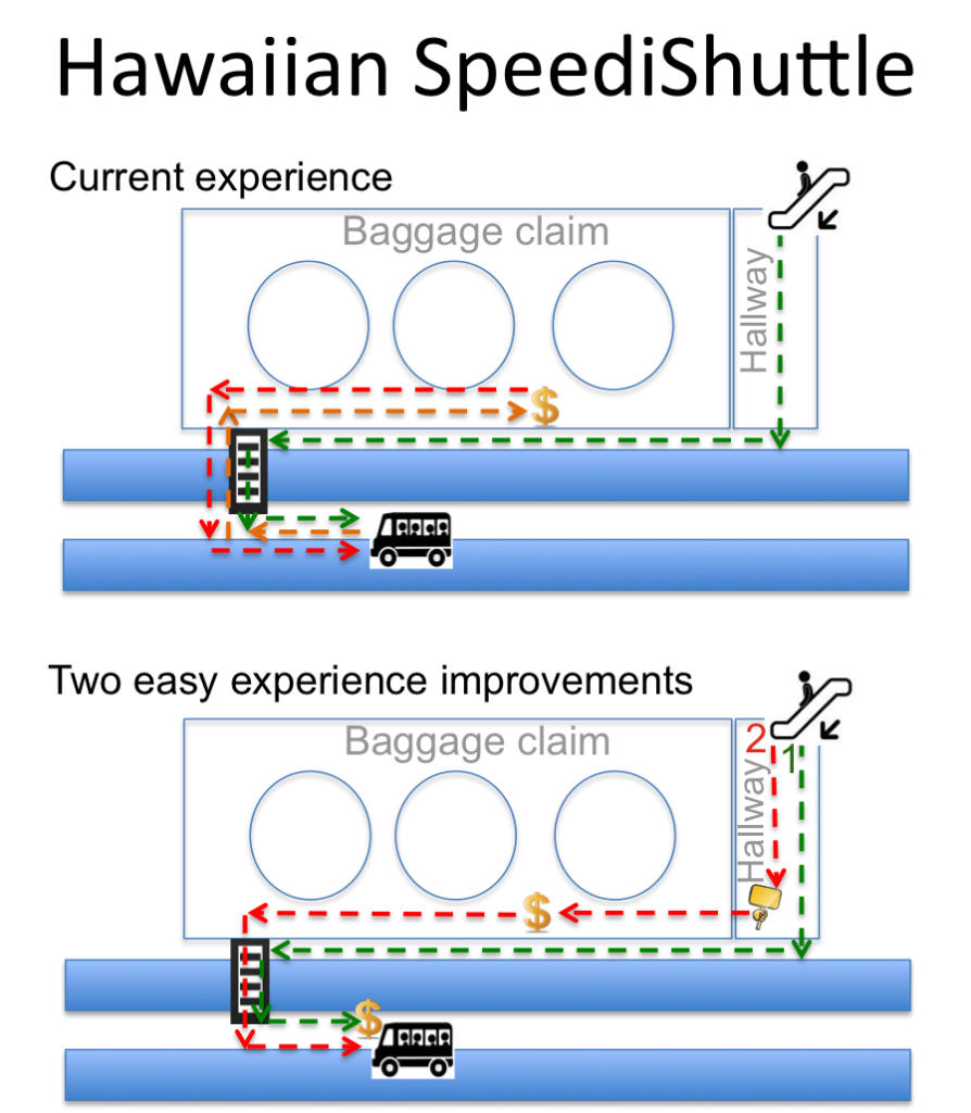
SpeediShuttle experiences: current and recommended

Facebooktwitterredditpinterestlinkedinmailby feather

LinkedIn: Let users tell you more about themselves!

Background: As a job seeker, I’ve applied to many positions that LinkedIn has shown me—but usually through a company’s website directly. Clearly, LinkedIn doesn’t know I’ve done that, but it would be really easy to allow me to tell LinkedIn.

Problem: Right now in LinkedIn, you can only “hide” jobs—by pressing the little X in the top right corner of the job tile, which means that LinkedIn doesn’t know WHY people are “hiding” jobs… Are users not interested? Have they applied some other way?

Recommendation: LinkedIn could offer another way for users to check off that they applied elsewhere, which would provide LinkedIn various pieces of useful information that could be used to help users, their own targeting, and the companies placing job descriptions.

Business Benefits for LinkedIn:

  • Increased user relevance: LinkedIn will have a better idea of what jobs this person is interested in so as to improve tailoring of other recommendations and not have critical page real estate dedicated to jobs that the person has already applied to.
  • Better analytics around what jobs are applied to through linked in vs. not.
  • Improved knowledge about whether people who applied through LinkedIn are more likely to get/take a job than those who applied to a job another way.
  • Better value proposition for the listing companies since LinkedIn will be showing more roles that the user has not applied for yet.

User Benefits: From the user’s point of view, this improvement can also reduce their concern over how LinkedIn interprets using the “X” to hide that job. Instead they get to feel more secure that they’re giving accurate information back that can help LinkedIn to know that job was definitely relevant—so relevant that they applied for it!

LinkedIn

Example of how to improve the site to provide better information to LinkedIn

Facebooktwitterredditpinterestlinkedinmailby feather